Welcome, Albert
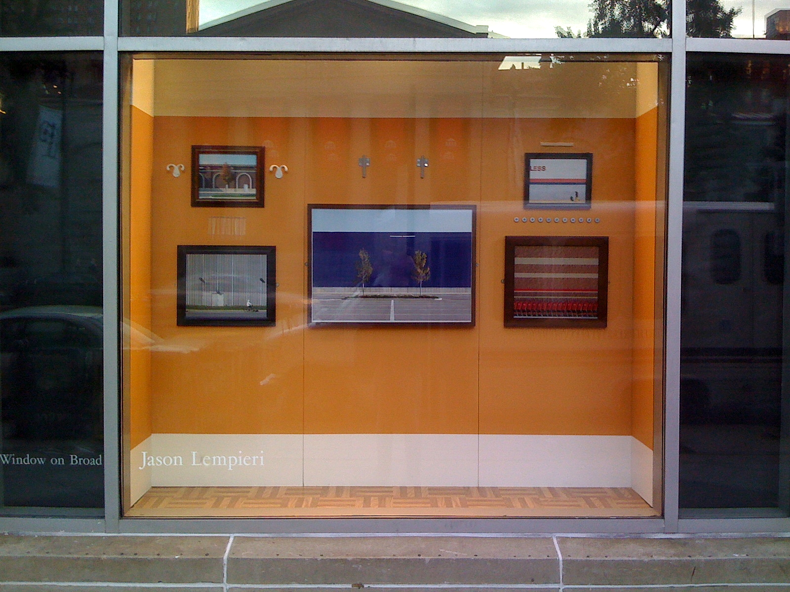
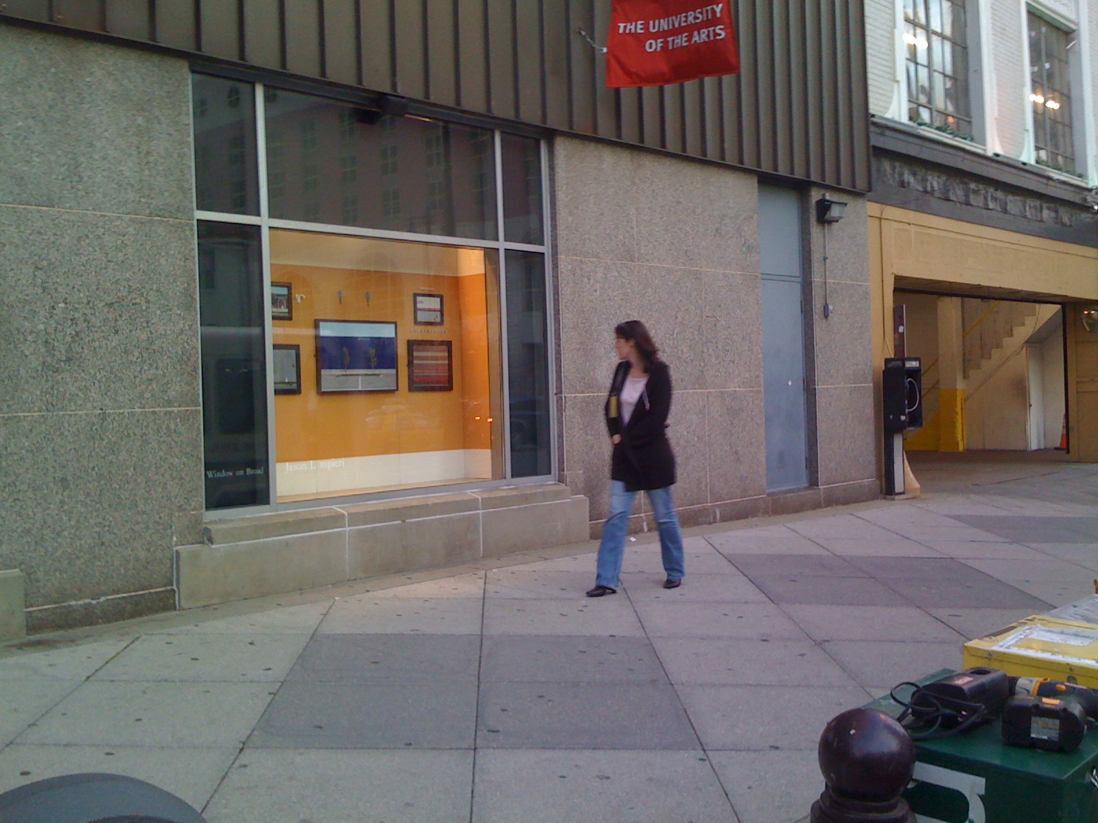
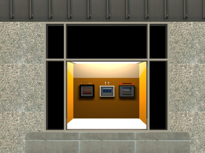
Set within a storefront on a main thoroughfare in center city Philadelphia, the installation Welcome Albert is a witty homage to Alfred Barnes and his art collection. The prescient installation showed five images of familiar big box stores within everyday frames, surrounded by hardware acquired at the same retailers. The hardware reflected the form language within the imagery while commenting on the banality of the American suburban landscape. This in contrast to the inherent beauty and sophistication of the display and works acquired abroad by Mr. Barnes.
*What you are looking at is everyday architecture. These buildings are frequented often and therefore play a significant role in the way that we experience visual aesthetics. Being inundated on nearly a daily basis with this visual illiteracy has dulled our senses. In addition, the economic expediency of the buildings’ materials (Concrete Masonry Units, painted metal siding, prefabricated concrete panels) appeals to our collective pragmatism. With corporate logos expressed as a banal billboard, the decorated shed becomes brand identity: a soulless corporate box in a sea of asphalt whose existence is temporary.
Yet, when these corporate institutions arrived in Philadelphia, they were received with remarkable fanfare. New jobs and tax revenue for the city were celebrated as the suburban big box began to gain a foothold. Lost to this competition were the department stores of yore--Gimbels, Strawbridges, Wanamaker’s et al. The former was demolished to make way for a recession-proof parking lot. Strawbridge’s building’s only hope at the moment is a casino. The latter, now a Macy’s, is the last Department store standing--its venerable volumes, designed by Chicago’s Daniel Burnham, filled to half its potential. Despite that, its Italianate design maintains a reverential air and still makes consumption a valuable experience.
*It has not been the same reception for the Barnes Foundation. With its priceless collection and world-class architecture (despite the legal internal form constraints), its future presence on the Benjamin Franklin Parkway has been met with much derision. When its doors do open, Philadelphia will be a tourist’s multi-night or repeat destination. This will garner the city innumerable benefits from a revenue perspective while simultaneously raising its cultural cachet. Hopefully, Albert Barnes’ collection being more accessible and housed in true architecture will help to revive our anesthetized senses.
The Barnes collection has a series of curious curatorial accessories. Placed above and around the paintings, handcrafted metal fasteners adorn the walls. Rescued from certain rust or melt-down, these iron artifacts relate to the works if one is visually literate. Discovering the link between them and the paintings is like a game, where knowledge of visual aesthetics is the currency. Arced shapes mimic voluptuous forms and spiked finials echo eye-lines and vectors. * The everyday architecture imagery shown here plays the same game, but this is done with the hardware of today. Instead of hardware uniquely made by journeyed craftsmen, these products of mass production are designed anonymously. They are an example of an ndustrial vernacular that, when taken out of context, can be seen as attractive. This hardware responds to the purposefully banal imagery as a nod to the forthcoming collection up the street: a collection that will have more resonance and cultural currency than all of these big boxes will ever achieve.
Furthermore, the frames that surround these images, like the industrial hardware, were all bought at the same big boxes. They beckon to the wonderful woodwork frames of the Barnes collection, yet with an inherent cheapness: a flattened facsimile that propels a consumerist ideal founded on veneer, temporariness and artlessness.*


