GHOST BIKES
We perceive a bike’s silhouette as a joyful token recalling carefree childhood days, where one has achieved a sense of independence and an expansion of boundaries. Nearly everyone has this association given that learning to ride a bike is a key childhood development. Yet, so is learning to drive a car. And therein lies the conflict as both means of transport share the same road that is often designed without the bike in mind.
Since 2003, Ghost Bike memorials have appeared across the nation and the globe as this conflict is endemic to wherever the two types of transport meet. Created that year as a response to the growing epidemic of cars striking cyclists in St. Louis, Patrick Van Der Tuin brought a painted white bike to the site where he witnessed a car drift into the bike lane and hit a cyclist. The Ghost Bike is a moving example of emergent memorialization. Choosing white over mourning black allows the silhouette of the bike to be in stark contrast with its context. Often stripped of its brakes, chain and gears, the bike is displayed locked to street infrastructure, glaringly present and unmovable.
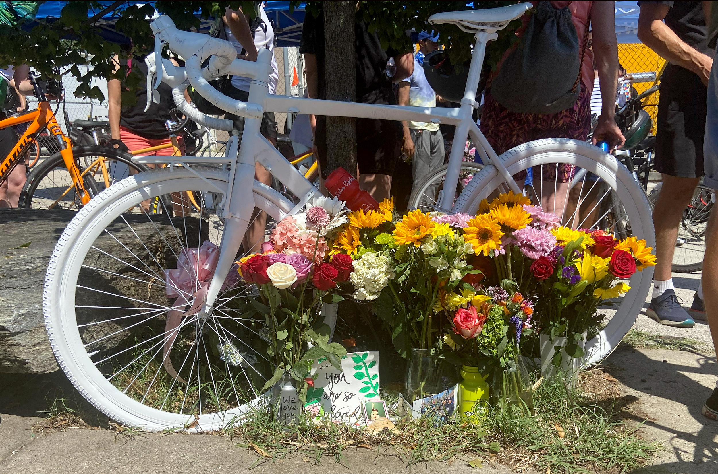
The intent of placing a Ghost Bike is multifold: to raise awareness of the dire consequences when drivers do not share the road, to call out the responsible street departments for their inaction and to provide a place of mourning for friends and family at the site where a cyclist was killed. Many of these memorials are maintained by families throughout the year. Often the bikes are adorned with flowers and notes and serve as totems for anniversary vigils.
Despite the elevated awareness of bike-related injuries and fatalities, street departments have been slow to make permanent and safe changes to roadways. States do not prioritize public service announcements in varied media on the safe sharing of roadways. Drivers have become notoriously impatient and distracted, and their vehicles have grown in scale and mass leading to a more likely fatal result for bicyclists. Government-regulated car design has turned to further protecting the passenger with larger windshield pillars that obscure peripheral views.
And the media consistently label bike-related fatalities as “accidents”, often leaving out the context and follow-up reporting. The reporting seems to be written by AI versus an empathetic human. Ideally, the reporting should lead with who these cyclists were: a husband and father of three young children, a loving daughter who made your delicious dessert at your favorite restaurant, a foreign serviceman who represented you abroad. Three of the photographs in the calendar represent Ghost Bikes installed for these victims.
As we age, the bike becomes understood as an efficient and sustainable means of transportation. We use it to commute, for sport and camaraderie. We adore teaching our children to ride a bike and are proud when they reach that milestone. We need to strengthen that connected memory--that the people memorialized in these photographs through their Ghost Bikes were once those children and deserved safe and protected lanes of travel.
KYLE SHENANDOAH, PHILADELPHIA
Emily Fredricks, Philadelphia
Kelsey Rennebohm, Boston
Shawn, washington dc
Geisterrad, Kassel, DE
Spøgelsscykler, Copenghagen, DK
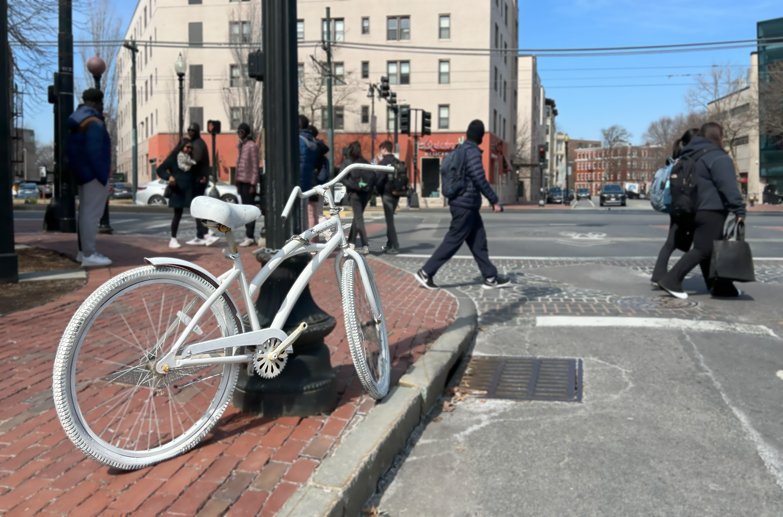
Darryl, Harvard Square, MA
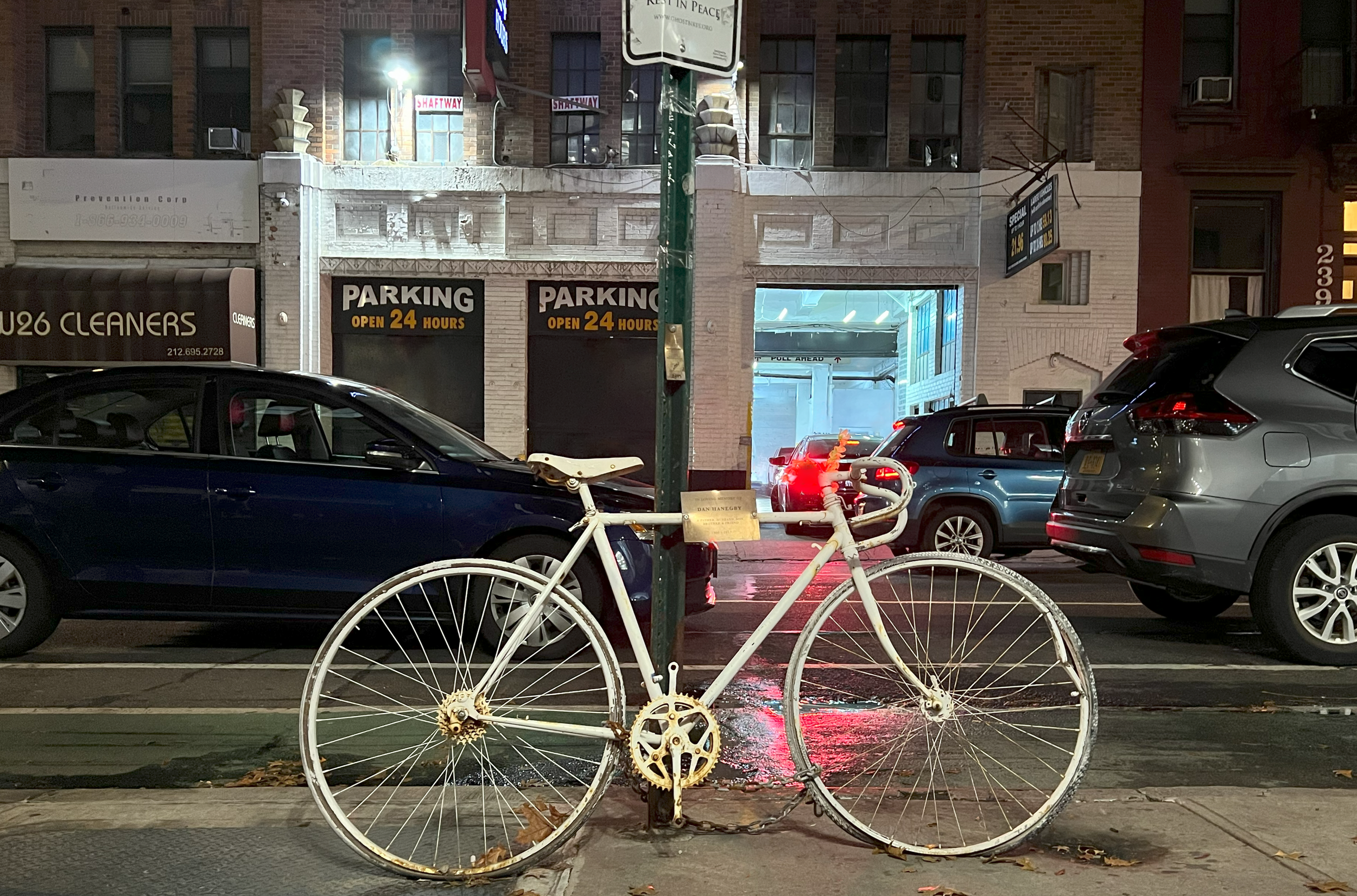
Dan Hanegby, NYC, NY
Susan Hicks, Pittsburgh, PA
Liza Whitacre, Chicago, IL
Malik, Washington,DC
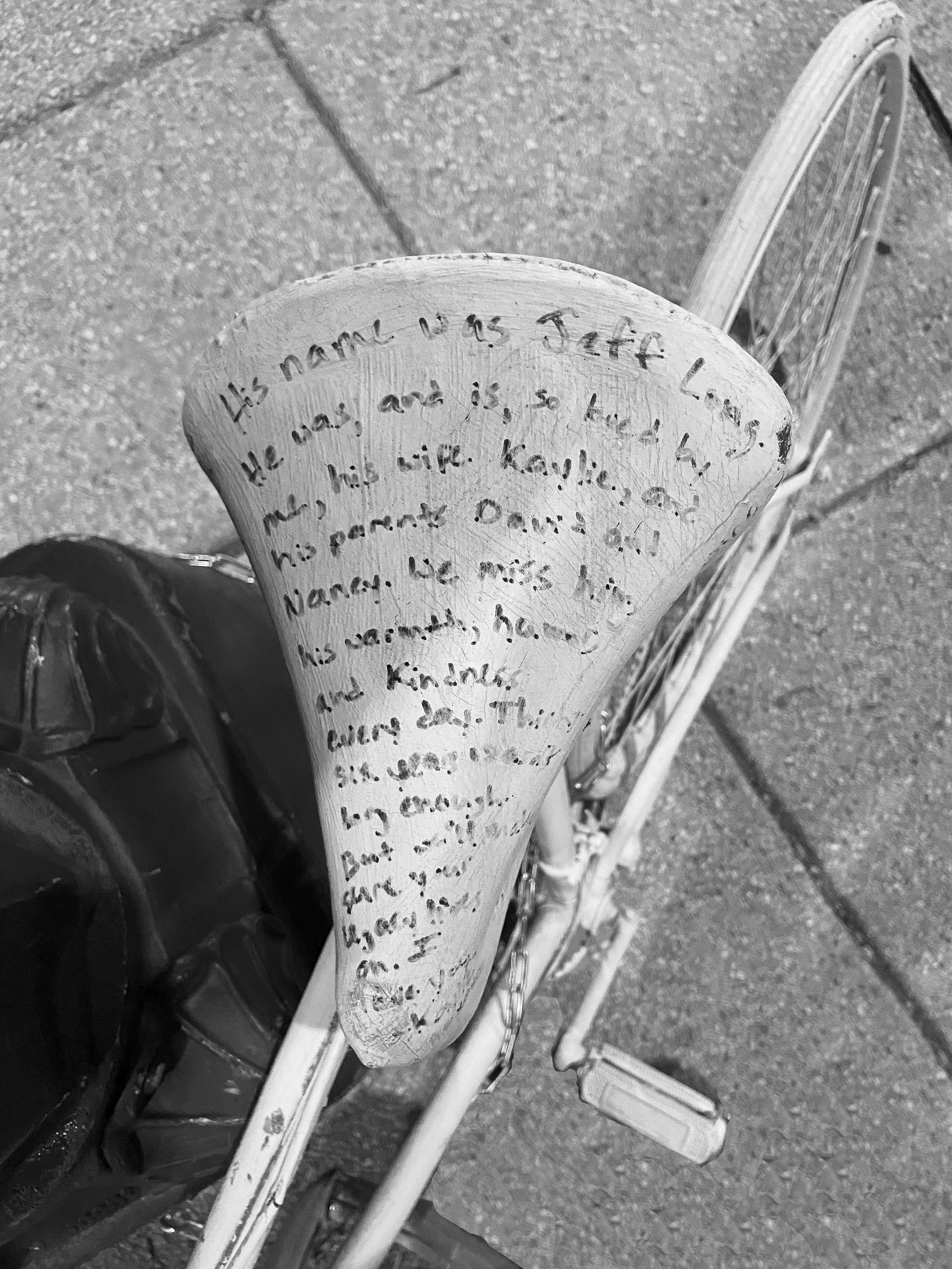
Jeff Long, Washington DC
Jeff long’s bike seat with memorial text
“His name was Jeff Long. He was, and is, so loved by me, his wife kaylie, and his parents David and Nancy. we miss him, his warmth, humor and kindness every day. thirty-six years wasn’t long enough, but we will make sure your legacy years lives on. i love you, kaylie.”
WANT THESE Ghost Bikes AS A very depressing 2024 CALENDAR? IF SO, DOWNLOAD IT HERE FOR FREE! LARGE FILE.
PRINTING INSTRUCTIONS FOR TOP LOADING PRINTERS-LOAD SEVEN LETTER-SIZED PAPERS (8.5X11) PORTRAIT/VERTICALLY ORIENTED IN YOUR PRINTER. PRINT THE ODD NUMBERS ONLY FIRST. ADOBE ACROBAT IS THE EASIEST WAY TO DO THIS. TAKE THAT PRINTED PACKET, FLIP IT OVER without rotating. PLACE THE PAGES BACK IN THE PRINTER. DO NOT SEPARATE THE PAGES! KEEP IT AS A PACK. THE BLANK SIDES SHOULD BE FACING YOU. now PRINT THE EVEN NUMBERS ONLY. SCORE THE CENTER LINES OF THE ODD SIDES. FOLD FOR A CRISP EDGE AND ARRANGE THE PAGES SO THEY MAKE THE CALENDAR IN ORDER WITH "HAPPY NEW YEAR ” AS THE COVER WHEN ASSEMBLED. JULY IS THE MIDDLE OF THE CALENDAR, THEN JUST STACK THE REMAINING MONTHS OF THE YEAR WITH THE COVER LAST. THIS IS THE EASIEST METHOD. THE CALENDAR SHOULD BE IN THE SAME ORDER AS THE IMAGES POSTED HERE. THEN FIND A WAY TO STAPLE THE CENTER AT THE ENDS OF THE CENTER LINE. STAPLE THROUGH THE COVER. THERE’S A CIRCLE AT THE TOP OF EACH PAGE FOR A PIN. WE SUGGEST HEAVY-WEIGHT PAPER LIKE BROCHURE OR CARD STOCK. SEND US A PHOTO OF YOUR HANGING CALENDAR WHEN COMPLETE TO INFO@RETHIKTANKDESIGN.COM. WE WILL RESPOND WITH A UNIQUE tombino.shop COUPON CODE. ENJOY!


